Home Lincoln Community School

Lincoln Community School

Goals:
Refresh brand identity for American International School in Accra, Ghana to reflect dynamic energy of student population while reflecting community and cultural values, both locally and internationally. With students from over 60 nations, Lincoln Community School is an accepting and diverse environment located in one of the most culturally rich and colourful countries in the world.

A pre-Covid student-led initiative proposed modernization of the former logo which didn’t “pop” for social media, online applications, team uniforms, and swag.

School administrators and parent groups elected to take the opportunity during the Covid shutdown and online learning only period to welcome students back with a bright, uncluttered, streamlined, optimistic symbol for the community.
Strategy:
  • Research LCS custom Adinkra symbol.
  • Research Adinkra symbol consensus meaning to capture “Lead. Learn. Connect.” motto with the appropriate symbols.
  • Perform audit of branding for peer schools throughout Africa.
  • Review student community survey results.
  • Review student work to break down all elements and colors.
  • Create and process data from community and stakeholder survey to receive input on values, priorities, and potential elements of new identity.
  • Concept:
    Based on survey data, we also wanted to avoid the shape of a shield which a majority saw as a potential symbol of aggression.

    Established in 1968, Lincoln Community School’s former logo reflected a traditional coat of arms, familiar from higher education institutions such as Harvard, to emphasize the high level of quality education. From its colourful Kente cloth to its traditional music and dances, Ghana possesses one of the most inspiring and colourful cultures in all of West Africa.

    A custom “Adinkra” symbol (a traditional Adinkra are symbols from Ghana that represent concepts or aphorisms) was created to represent the school’s values, and it was important that we include Adinkras in the new logo as well.

    Partially because Covid had impacted many students with fear and uncertainty, we understood that there was an utmost importance in creating a symbol that united the community and provided a sense of safety, courage, and pride.

    As a result, we chose to focus on the school mascot, the Lincoln Lion, a brave, proud, malevolent, but not aggressive or frightening. Because we worked with the school community for many years as contracted photographers, we were also aware that whenever the Lincoln Lion made an appearance at pep rallies and games, young and old seemed to be overjoyed to see and touch the Lion, like one would a beloved rock star.

    We updated the colors to be more vibrant for multi-media applications, and coupled the best matched Adinkra symbols to “Lead. Learn. Connect.” – the school motto.
    Deliverables:
  • Design identity including logo mark and tagline
  • Provide one round of revisions to design
  • Logomark variations
  • Style guide
  • Email signature
  • Letterhead
  • Results:
    School administrators and parents overwhelmingly supported the new identity. Based on the new style guide, and enthusiasm from students, staff and faculty incorporated the new colors and design into school uniforms, the website, communications, sports uniforms, and a wide variety of swag.
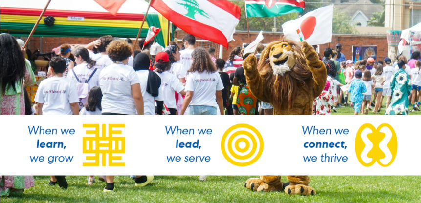
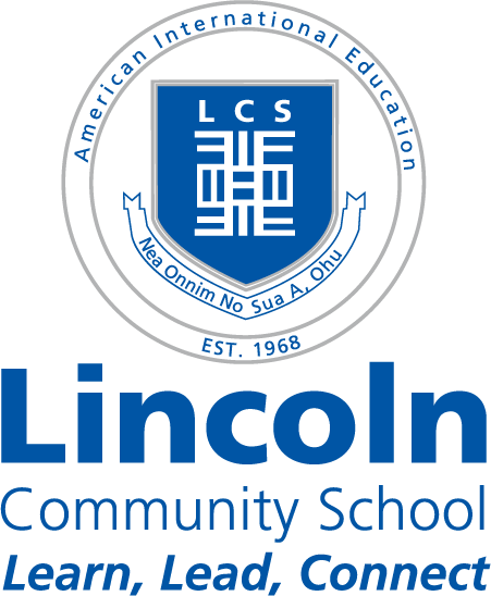
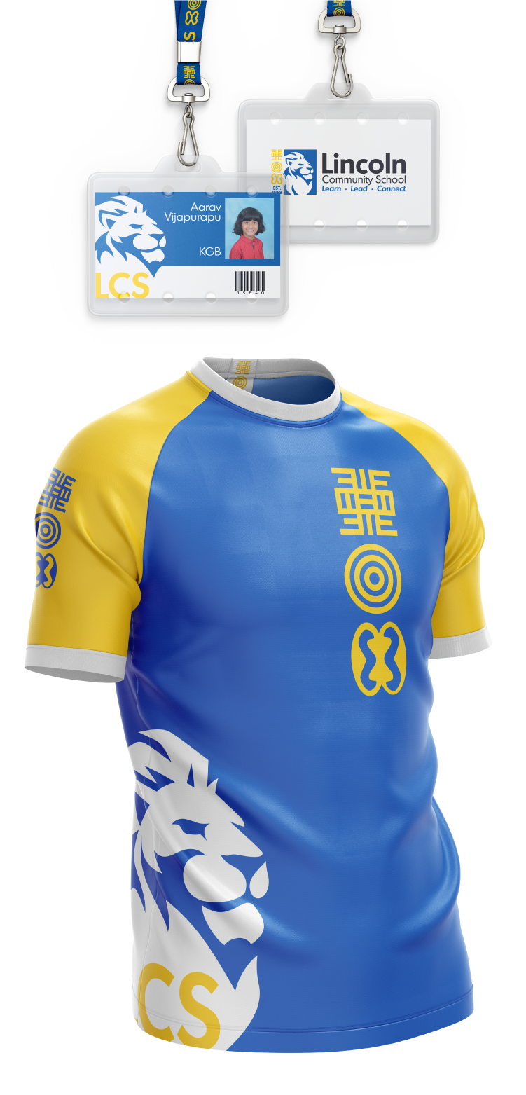
    "Our logo is everywhere! (The community is) loving it. Isn't it interesting how quickly these things change and become embedded in the culture of the organization. Creative Catalysts were amazing to work with, they were at all times professional and yet very personable. They really listened to our needs and worked collaboratively with us. We were delighted with the results."
    – Lesley Tait, Head of School, Lincoln Community School

    Project Date

    2022

    Project Type

    Identity & Rebrand

    Client

    Lincoln Community School
    Pre-2022 Logo