Bike Works
Goals:
Update brand identity for the organization’s 20th anniversary in conjunction with a revised strategic plan. Migrate from the “pig boy” logo that was hurriedly scribbled on a napkin at the inception of the organization to an identity with stronger overtones of inclusivity, empowerment, and social justice. The new identity needed to embody transformation serve as a beacon particularly to youth, and to look more like its staff and the community it serves including culturally and gender diverse individuals, and its ability, “to meet people where they are.”
“Bike Works is growing up. We need to communicate that this is a multifaceted organization with stacked development options for more than just little boys.” - Tiffany, Development Director
“Bike Works is growing up. We need to communicate that this is a multifaceted organization with stacked development options for more than just little boys.” - Tiffany, Development Director
Strategy:
Concept:
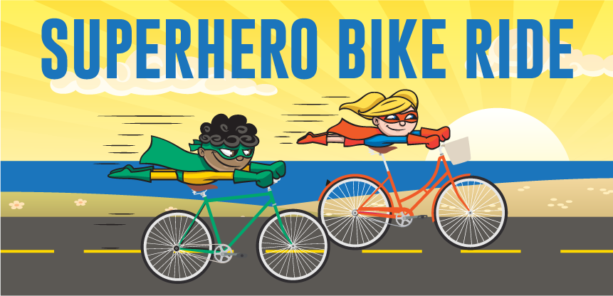
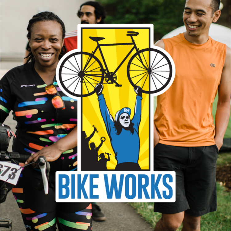
We uncovered strong undertones of empowerment and camaraderie, and the transformative energy driving the outcomes of the programs and deeply embedded in the history of the bicycle, we were led to images of superheroes and classic union imagery from the early 20th century depicting the way individuals are powered up by the strength of intentional community.
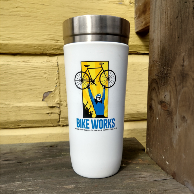
We scrapped scrappy (with a nod to the original logo on the hat worn by the new individual) in favor of an ethnically and gender-ambiguous “superhero” styled individual with a nod to comic books and union propaganda.
We scrapped scrappy (with a nod to the original logo on the hat worn by the new individual) in favor of an ethnically and gender-ambiguous “superhero” styled individual with a nod to comic books and union propaganda.
Deliverables:
Results:
Enthusiastic reception for new identity.
62% increase in fundraising within two years partially credited to the invigorated identity representing the vitality, breadth, and impact of the organization.
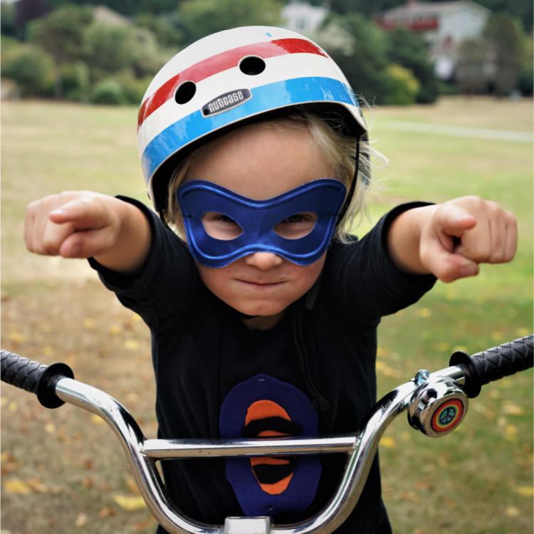
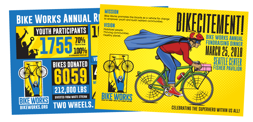
Identity has continued to be carried through every aspect of the visual communications of the organization, effectively “flexing” to incorporate different themes and occasions to serve as a beacon to potential funders and program participants.
Identity has continued to be carried through every aspect of the visual communications of the organization, effectively “flexing” to incorporate different themes and occasions to serve as a beacon to potential funders and program participants.
“In 2015, Bike Works assembled a group of staff and board volunteers to come together to work on a new strategic plan to guide us from the end of the previous strategic plan... What came out of this is a new logo and comprehensive strategic growth and strengthening plan for the organization, based on the ideas and feedback from the Bike Works community. Now that Bike Works is in its 20th year, we felt that the old logo didn’t fully represent the breadth of what we offer today and feel like the new one is better representation of Bike Works growth.”
- Bike Works communications
Project Date
2016 - Present
Project Type
Identity & Rebrand
Client
Bike Works
"Pig Boy"
